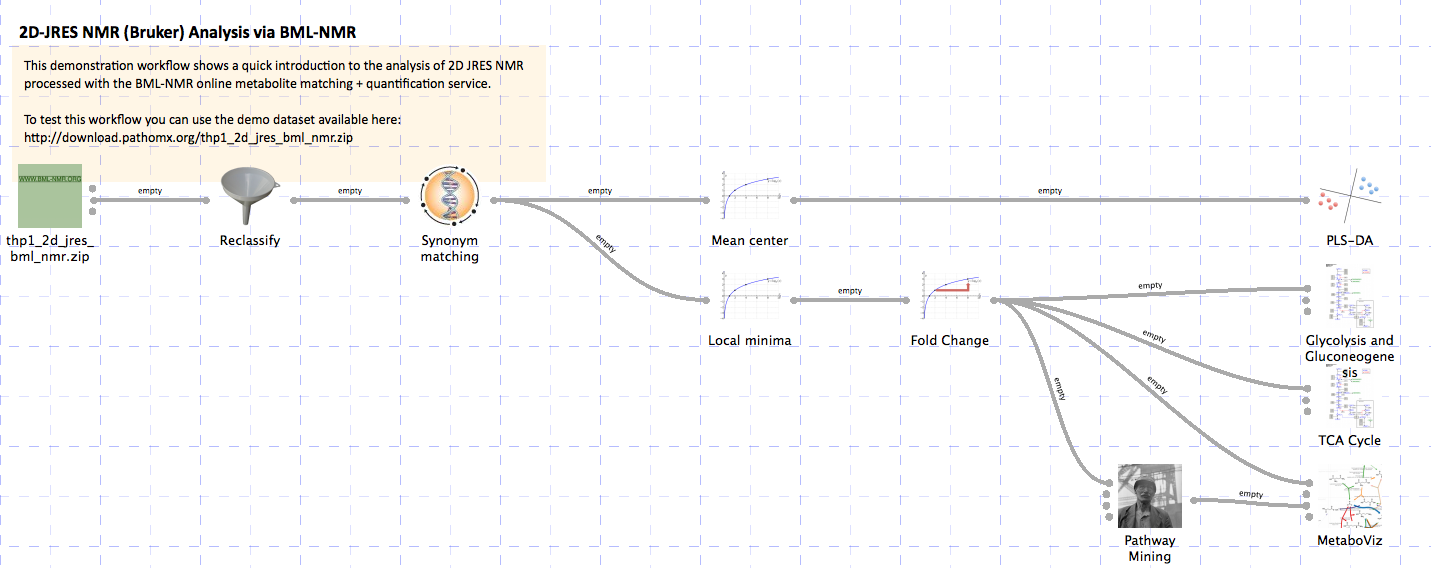
2D-JRES NMR (Bruker) Analysis via BML-NMR
Analysis of 2D J-Resolved NMR spectra (in Bruker format) previously processed using the BML-NMR service. The resulting processed data zip-file is loaded and assigned experimental classifications. Metabolites are matched by name using the internal database and then analysed using a PLS-DA. The log2 fold change is calculated for each metabolite (replacing zero values with a local minima). The resulting dataset is visualised on GPML/WikiPathways metabolic pathways. The data is additionally analysed using a pathway mining algorithm and visualised using the MetaboViz pathway visualisation tool.
You can download the completed workflow or follow the steps below to recreate it yourself. This workflow is also distributed with the latest versions of Pathomx and can be found within the software via Help > Demos.
The data used in this demonstration was derived from the culture of THP-1 macrophage cell line under hypoxic conditions for 24hrs. Metabolites were extracted using a methanol-chloroform protocol. The class groups used here represent (N)ormoxia and (H)ypoxia respectively.
Background
The Birmingham Metabolite Library (BML-NMR) provided by the University of Birmingham also hosts an automated NMR spectra fitting service designed for 2D JRES NMR spectra. These low-resolution spectra have the advantage of being relatively quick to acquire while offering the resonant peak-separation found in full 2D spectra. Quantification and identification accuracy is in the 70-80% (dependent on source material) and may be sufficient for quick analyses.
This workflow takes the .zip output of the BML-NMR identification service and processes it to perform multivariate analyses, visualisation on WikiPathways and pathway-analysis-generated automated pathway visualisation. The overview of the pathway is as follows:
To test the workflow as it’s built you’ll need to download the demo dataset and sample classification files. You don’t need to unzip the dataset, it is the exact same format that comes out of the BML-NMR service and Pathomx can handle it as-is. The sample classification file is in CSV format and simply maps the NMR sample numbers to a specific class group.
Constructing the workflow
The workflow will be constructed step-by-step using the default toolkit supplied with Pathomx and a sample set of outputs shown along the way. If you find anything difficult to follow, let us know.
Importing data
Start up Pathomx and find the BML-NMR tool in the Toolbox panel on the left (the icon is a green square). Drag and drop it into the workflow editor to create a new instance of the tool. Select it (turning it blue) to activate it and get access to the configuration panel. Here click the open file button and browse to the downloaded demo data file.
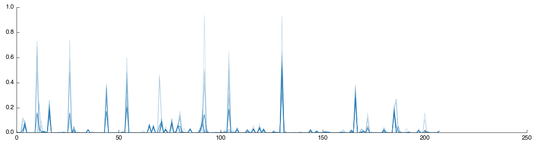
The tool will now run, extracting the data from the zip file and processing it for use in Pathomx. A number of outputs will also be generated including 3 data tables and 3 figures for the Raw, TSA-transformed and PQN-transformed datasets from the file. If you click on the PQN figure tab you will get a visualisation of the data you have just loaded.
Sample classification
The plot shows data for all the samples together with the mean (shown as a thicker line). The dataset doesn’t currently contain any information on sample classifications, so we’ll add them now. Drag a Reclassify tool into the workflow editor. It will automatically take data from the Raw output of the BML-NMR tool but we want the PQN output. So correct this by dragging from the PQN output to the input for Reclassify (the previous connection will automatically disconnect).
If you select the Reclassify tool and select the View output you will see exactly what you saw in the BML-NMR tool. That is because we haven’t set up any reclassifications. You can do this in two ways: manual, or automatic from a CSV file import. We’ll do the first one manually, then give up and do it quickly.
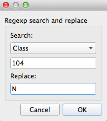
Select the Reclassify tool you just created. In the configuration panel on the left select Add to get the reclassification box. Select ‘Sample’ from the drop-down list (this means we’re matching against the Sample number in the current data) and then enter 104 in the input box. Under Replace enter N (this is the value we’ll replace sample 86’s class with). After you click OK the assignment will be added with the reclassification table and the tool will recalculate.
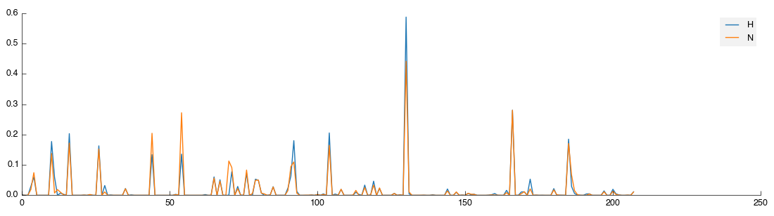
Select the View output and you will now see two lines: orange for the H class group and blue for the remaining unclassified samples.
That’s not a huge amount of fun, so a quick way to get sample class matches is provided. To use this activate the Reclassify tool then in the configuration panel click the Open File icon (bottom right, next to Add). Select the 2d_classifications.csv file you downloaded earlier and open it. You will be presented with a drop-down box to select the field on which to match, again choose ‘Sample’. The full set of class assignments will be loaded and samples assigned properly. If you check the view again you’ll get two clearly marked groups like the image below:
Except it isn’t quite. Because we matched a single sample to begin with Pathomx needed a colour to identify the ‘No class’ group and took the first available (blue). So instead of the above figure, you’ve probably got one in green and orange. To fix this in the main application window select Appearance > Line & Marker Styles. You’ll see this:
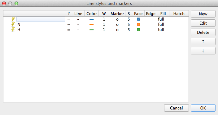
This dialog is the central control for the appearance of class groups in figures throughout Pathomx. Any change to the colours assigned here determines how they show up in every figure. Select the row for N and clicking Edit. For the Line setting click the colour button and then choose something obnoxious like pink. Save the settings by clicking OK, reselect the Reclassify tool and click the green play button on the control bar to re-run it. Your N line should now be pink.
Enough fun. Go back to Appearance > Line & Marker Styles and delete all the rows in the panel. Save it and return to your tool, hitting run once more. Now you should have the data visualisation displaying as shown.
Mapping data to databases
At present, though you wouldn’t know it, Pathomx knows nothing about what sort of data this is. It doesn’t always matter - you can process and analyse any type of data you like with Pathomx. However to make use of the biological analysis and visualisation tools we need to map the data we’ve imported to biological entities. The preference in the standard toolkit is to use BioCyc reference entities for this because of the coverage and free access via the public API.
So to begin our biological analysis, let’s map our data from the BML-NMR output to BioCyc entities.
Locate the Map to BioCyc tool in the Toolbox and drag it into the workflow editor. It will automatically connect to the Reclassify tool already in place. After attempting to process the data for a short while, the tool will finish successfully. However, it’s attempting to match using BioCyc metabolite names which don’t match exactly with those used in BML-NMR.
Select the tool to activate the control panel. From the drop-down list select FIMA (the name of the matching algorithm using by BML-NMR). The tool will recalculate and metabolites will be correctly matched. Unfortunately, the tool doesn’t yet show what it’s done (coming soon!) so for the meantime we can use another tool to get a look. We need to add the Mean Center tool anyway so do that now. It will accept the data and run. Select it, then the view tab to see the current state of the data:
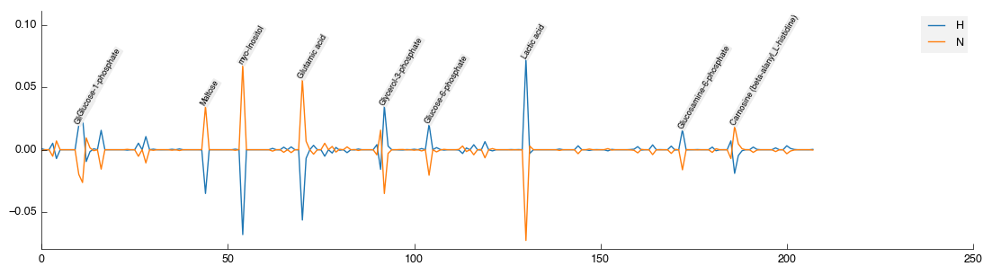
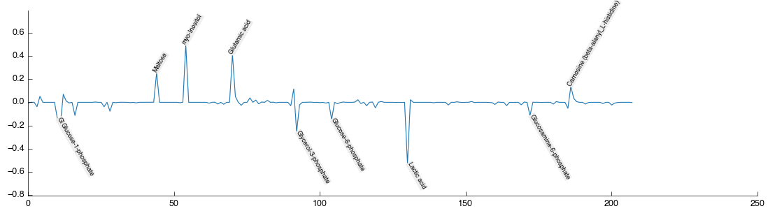
You’ll note that as well as being mean centered, the top quantities are now annotated with the metabolite that BML-NMR as identified.
Multivariate analysis
Performing a multivariate analysis can also be accomplished in a quick simple step by dragging and dropping the PLS-DA tool from the toolbox into the workflow editor. Again it will auto-connect and auto calculate to produce the following figures:
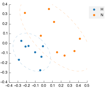
Note again that on the latent variable plot the data is annotated with the identified and mapped metabolites. This automatic annotation is available on all plots once the data table contains the relevant information (either mapped metabolites or text labels).
Pathway analysis
Next we’re going to generate three biological analysis visualisations - two using standard pathway maps (WikiPathways) and one using a pathway-mining algorithm approach to generate. However, before we do that we need to get our data into the right shape to allow it.
For visualisation of change it’s often useful to use fold-change (2-fold = doubled). However, it’s not possible to calculate a fold change from 0 and so a artificial minima must be created. Because the sensitivity of the NMR approach varies for different metabolites we will here apply a local minima (on a per-metabolite basis). The simple tool Local minima will do this for us. Drag it into the workflow. It will automatically take input from Mean center but replace this by draggin the output from Map to Biocyc into the input for Local minima.
Next drag and drop a Fold change tool into the workflow. Select it and in the configuration panel change the Control setting to N and the Test setting to H. We’ll generate the two WikiPathways views first as they are the most straightforward.
Drag 2x WikiPathways & GPML tools into the workflow area. They will probably raise errors (turn red) because there is currently no GPML file defined. You can download them both from WikiPathways here: Glycolysis and TCA Cycle.
Select the first WikiPathways & GPML tool and select the Open GPML button from the configuration panel. Select the Glycolysis pathway you downloaded (WP534_74524.gpml) and open it. You should see the following:
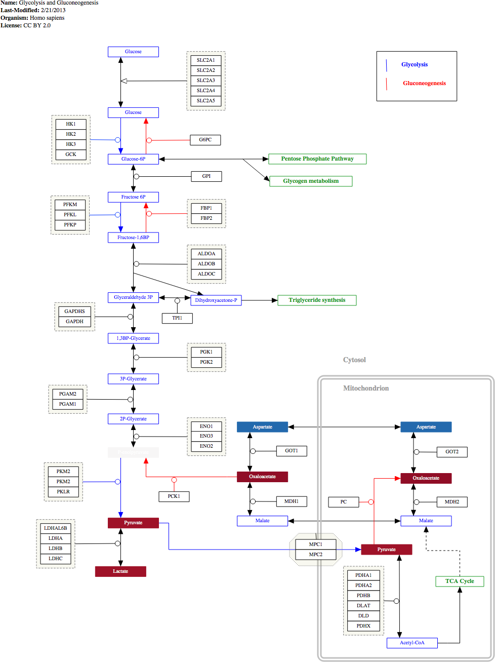
Repeat the process for the TCA cycle visualisation too.
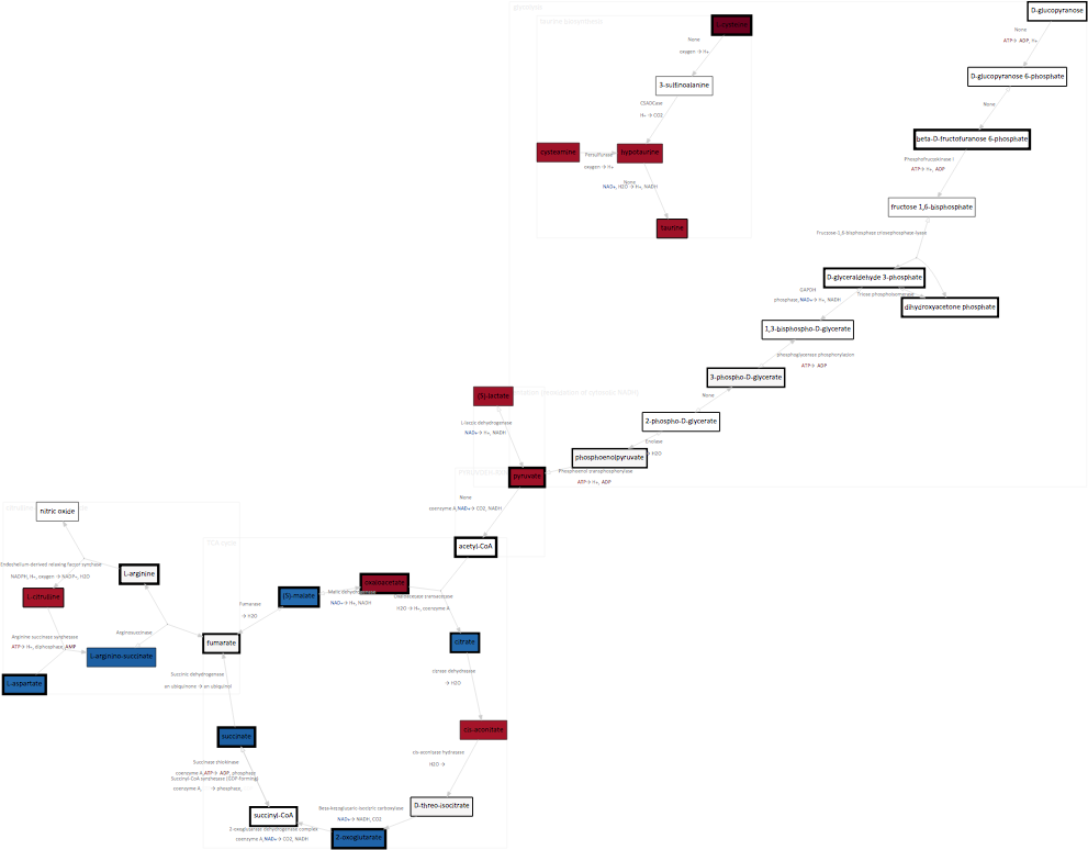
Pre-drawn pathways like these are fine if you know what you’re looking for and where the likely biological changes will occur. But sometimes it’s useful to be able to visualise experimental data on a pathway map and use that to infer the biological basis for what is happening. Pathomx ships with a pathway mining algorithm pathminer that allows you to identify the most altered metabolic pathways from a dataset and metaboviz a dynamic pathway drawing algorithm. These are available through the tools Pathway Mining and MetaboViz respectively.
First, drag the Pathway Mining tool to the workflow editor. Leave the settings as default for now. Next, drag in a MetaboViz tool. The pathway suggestions from the Pathway Mining tool will be correctly connected, however you’ll also want to drag the output of Fold change to the top input compound_data on the MetaboViz tool. If you click on the MetaboViz tool you’ll notice that you already have a pathway map drawn.
We can filter the pathways returned by the pathway mining algorithm to make it easier to visualise (you need <5 usually to get a clear layout). So select the Pathway Mining tool and on the Include/Exclude tab of the configuration select to include only the following:
- Biosynthesis/Amino acid biosynthesis
- Degradation/Amino acid degradataion
- Generation/Acetyl-coA
- Generation/Fermentation
- Generation/Glycolysis
- Generation/Other
- Generation/TCA cycle
Which should give you an output not dissimilar to the following -
Things to try out
If you’re feeling adventurous there are a few things you can experiment with the workflow -
- Perform a Principal Components Analysis (PCA) hint: use the output of the Mean Center tool
- Export the list of mined pathways to a CSV format file hint: use Export dataframe
- See if metabolites in the dataset correlate hint: use the Regression tool